The business & the brief.
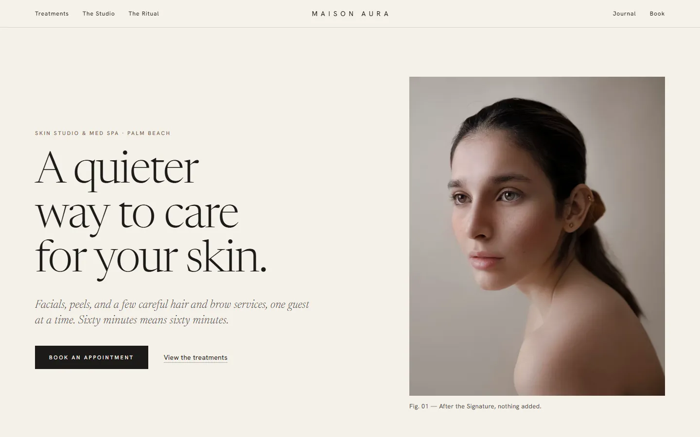
Maison Aura is a fictional skin studio and med spa in Palm Beach that sees one guest at a time and prints every price on the menu. The site lets visitors browse treatments by concern, build an appointment as they read, and carry it straight into a four-step booking flow.
Maison Aura is a fictional business. This concept was designed and built by Obsidian Webworks to demonstrate what we create for beauty & wellness businesses. No client results are implied.
Look, feel & voice.
A luxury beauty editorial system: light Newsreader display type and refined italics, tiny tracked Hanken Grotesk UI, warm ivory and blush, 1px rules, square 4:5 and 2:3 crops and rectangular thin-border buttons. It reads like a skincare house catalog crossed with a slow fashion magazine, which matches a studio whose whole promise is calm and no upsell.
Built to bring customers in.
Treatments as a product catalog
Eleven numbered treatment tiles separated by hairline rules, each with concern, duration, price, a one-line note and an Add to appointment toggle.
Appointment tray
A drawer in the bottom corner collects chosen treatments, totals time and price (including from-prices and consult-only items) and persists across pages via localStorage.
Filter by concern
Hydration, Clarity, Calm, Renewal, Hair and Brows chips filter the catalog live, hide empty categories and announce the result count.
Four-step booking with an appointment card
book.html picks up the tray, then walks through a keyboard-navigable calendar, duration-aware time slots and validated details before printing a framed appointment card.
The Ritual in four slow steps
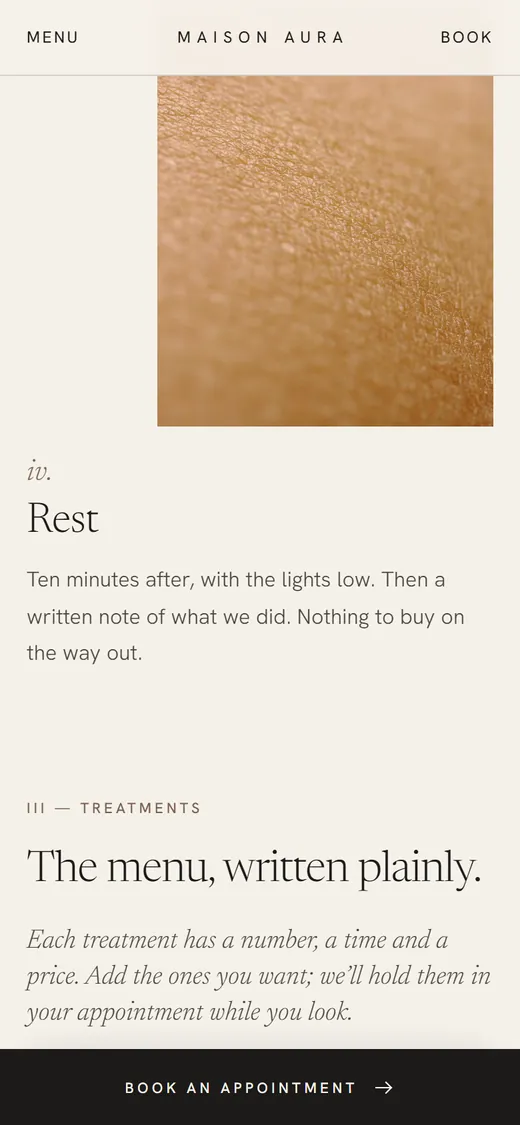
The home page sets the visit out as Arrive, Look, Treat and Rest in a staggered, descending editorial sequence.
Team portraits with hover notes
4:5 portraits reveal a short studio note on hover or focus on desktop and become a swipeable scroll-snap row with notes below on phones.
Mobile thumb-reach booking
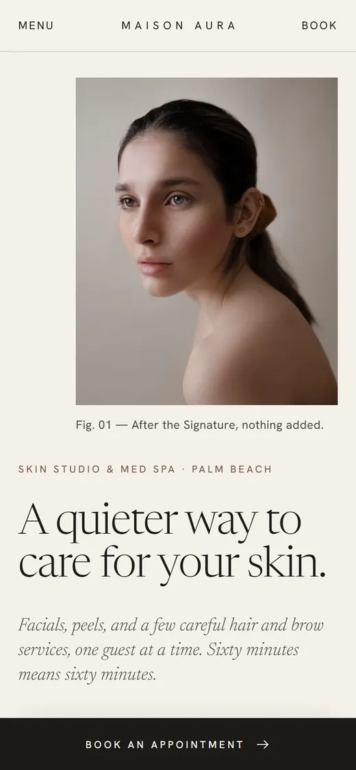
A sticky bottom Book bar turns into the tray summary once treatments are added and opens as a bottom sheet; the menu is a full-screen ivory overlay with large serif links and one image.
Brand journal
Three short notes written in the studio's voice, laid out in alternating image and text columns with pull quotes.
The full experience.
Hover (or tap) to scroll the entire homepage. Every section, top to bottom.

Designed for the phone first.
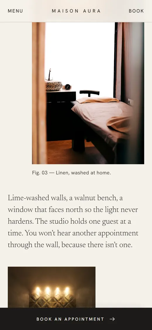
Most customers will meet this brand on a phone. The mobile layout is designed on its own terms, with thumb-friendly actions and a dedicated menu.
Site sections.
A complete, production-ready structure. Every section is designed, written and responsive.
- Hero
- The Ritual
- Treatments catalog teaser
- The Studio photo essay
- Meet the team
- The Philosophy
- Book
- Footer with newsletter
Want a website like this for your business?
Tell us what you do and who you serve. We’ll show you what your website could be.
Start Your ProjectMorrow Studio
Photography
Explore Project